Overview
After six years of neglect, Quick Promote (Twitter's entry-level advertising product) needed fundamental changes to meet Apple's App Store requirements and compete with modern alternatives. I took over the product in early 2022, structured the SMB design team so one designer owned Quick Promote while another owned Simple Ads, with shared principles between them, and rebuilt Quick Promote for iOS while significantly improving the web experience. The redesign improved clarity around ad goals, simplified targeting workflows, removed decision points that confused new advertisers, and moved entry points directly onto Tweets for better discoverability. The relaunch delivered a 30–40% increase in annual revenue on iOS, with a 30% uplift in conversion rates through a targeted welcome coupon program.
A Neglected Product, Revived and Reclaimed
Quick Promote had been Twitter's forgotten stepchild in the advertising suite. Launched in 2015 as an approachable way for professional customers to boost their Tweets without wrestling with the full advertising platform, it had served a purpose for creators and small businesses with limited digital advertising expertise. But somewhere between 2016 and 2022, it got left behind.
For six years, while Twitter concentrated its advertising efforts on enterprise accounts, Quick Promote received only maintenance. No feature improvements. No usability refinements. No discoverability investment. The product was tucked behind Tweet Analytics — a surface most professional users rarely visited. Usage declined. Revenue declined. The product had become the equivalent of a restaurant booth in the back corner that nobody remembers exists.
Then, in late 2020, Twitter made a strategic bet on diversifying its advertiser base. The company identified an opportunity to grow revenue from professional accounts outside the traditional large-brand segment. Quick Promote, suddenly, was relevant again. But relaunching it wouldn't be simple. Apple had flagged the product for App Store policy violations. The product needed fundamental changes to the workflow, the terminology, and how billing worked. Quick Promote needed to be completely rebuilt, not just refreshed.
In autumn 2021, after leading the Advertiser Experience Vision project, I took on Quick Promote alongside Simple Ads. The setup was intentional: one designer owned Quick Promote, another owned Simple Ads, with shared principles and regular collaboration between them. The Quick Promote designer was a strong talent based in London who got promoted during the initiative. My job was to ensure we were building something customers actually wanted to use, not just fixing a broken product.
The Challenge
Quick Promote faced problems across four dimensions. First, the product lacked any real understanding of its customers. Twitter had done minimal research on SMB advertising needs, which meant internal assumptions had filled the gap. Second, Apple's App Store requirements forced a complete rethink of the product's positioning, terminology, and how it handled payments. Third, years of neglect had created a perception problem: the product felt old and untrustworthy. And fourth, there was tension between two competing goals: drive revenue growth immediately while simultaneously setting customers up for long-term success so they didn't just buy once and abandon the platform.
How We Approached This
I organized the SMB advertising design effort around a structured set of principles that would apply to both Simple Ads and Quick Promote. Each designer needed deep customer knowledge: not just surface-level assumptions, but genuine understanding of what small business owners actually needed and how competitors were solving those problems. We committed to thinking about growth differently. Instead of optimizing purely for first purchase, we focused on setting customers up to win, educating them to become more sophisticated advertisers, and building the foundation for them to unlock larger budgets over time.
I also worked to prevent what could have been the easy trap: building custom solutions everywhere. Instead, we leveraged the existing Twitter platform, trained customers through content design, and kept interfaces deliberately simple. We saved custom components for situations where they genuinely provided distinct advantages. We defined clear boundaries around what Quick Promote should be and shouldn't be. This kept us from the feature creep that had plagued other SMB products.
That last piece mattered more than it might sound. I worked extensively with our Product Manager, Research partners, and cross-functional leadership to get alignment on what we were trying to accomplish. Not everyone agreed at first. Once we got there, it made every subsequent decision faster.
The London-based designer led the actual design work. I invested time understanding the product's history, coaching toward a product perspective that matched our goals, and asking difficult questions about whether we were adding complexity unnecessarily. The core tension I kept raising: how do we grow Quick Promote's revenue without constantly introducing new features that would overwhelm our target customers? It's like a restaurant that tries to serve everything on the menu equally well: you end up succeeding at nothing.
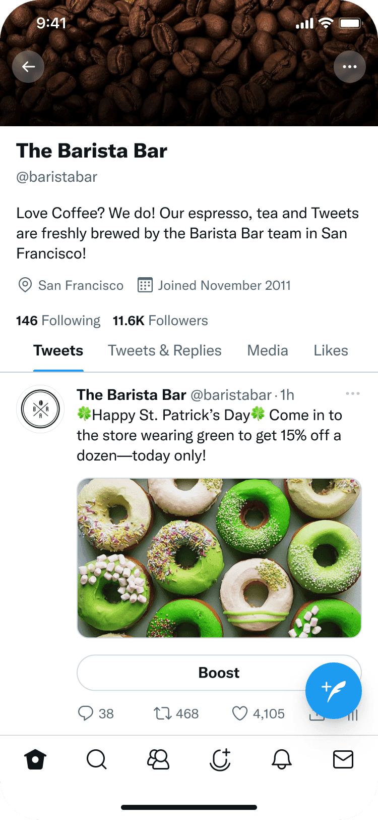
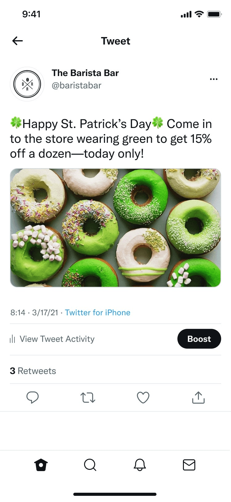
I also identified an opportunity that shaped the whole project. The original Quick Promote was reactive: customers published a Tweet and then discovered the boost feature afterward. What if we moved Quick Promote into the Tweet creation process itself? Customers could boost before publishing, during composition. That single shift in entry point dramatically increased discoverability and changed the entire flow.
What We Built
The work spanned two distinct experiences: an improved responsive web version for Twitter.com and Android, and a new native iOS experience designed from scratch to meet Apple's requirements. Throughout 2022, the team prototyped, validated approaches through research, and prioritized what would deliver the most impact.
For the web and Android experience, we completely redesigned the visual layer. Custom illustrations replaced the clinical interfaces. We refined hierarchy, color, and white space on every screen. The experience became more approachable for people new to digital advertising.
We redesigned the goal selection interface with much more context around each option. Icons. Progressive disclosure. Clear explanations of what each goal would help them accomplish. This sounds small, but it matters. New advertisers make better decisions when they understand their options. Iconography and careful interface design meant we could show context without drowning the screen in text.
The targeting interface got the same treatment. We refined the visual design across all platforms, with particular attention to touch interactions on iOS. We also introduced deliberate friction in some places: constraints that pushed customers toward better campaign setup decisions rather than letting them click through on autopilot.
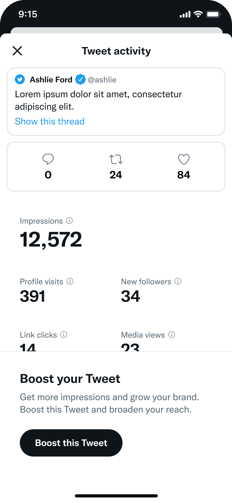
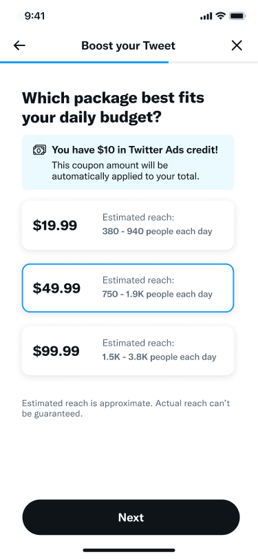
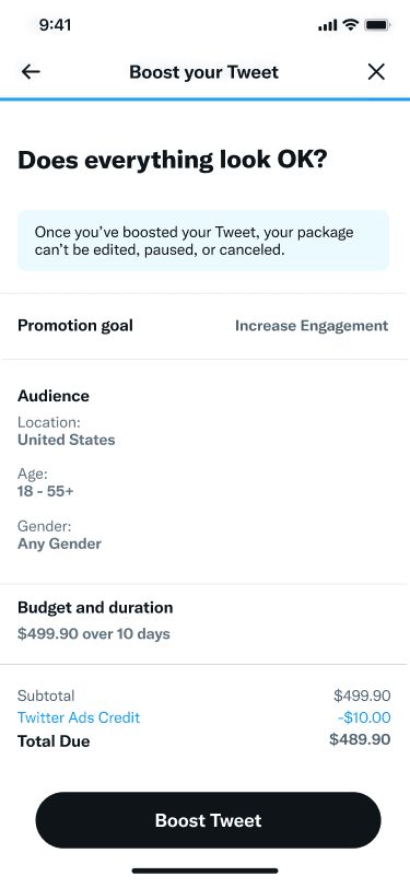
The iOS version required different thinking entirely. Apple's requirements meant Quick Promote could no longer present itself as an advertising product. The language shifted from "promote" to "boost." Goal selection disappeared — the product now focused solely on impressions and engagement. Budget controls were replaced with simple pricing packages, removing another decision point and source of customer confusion.
In-app payments replaced traditional credit card billing to comply with App Store policies. The workflow simplified further. I kept asking the design team: what's essential here, and what's just complexity? The result was cleaner, faster, and actually worked better for customers who'd never bought digital advertising before.
We also explored entry points for future expansion. One was a coupon workflow designed to encourage new and returning customers to try the improved product. Another was integrating Quick Promote directly into the Tweet creation flow: imagine composing a Tweet and boosting it before you hit publish, all in one motion. We prototyped integrations for new formats like Spaces and commerce features. These weren't built yet, but Design had already mapped the path forward.

Results
The relaunch on iOS in mid-2022 delivered measurable impact, with Social Media Today reporting (opens in new tab) on the streamlined boost experience that emerged from the redesign. Throughout the second half of 2022:
What We Learned
The most valuable lesson was about prioritization. We improved Quick Promote not by adding features, but by removing obstacles and making the existing experience clearer, faster, and more thoughtful. That approach delivered better business results than adding features in hopes something would stick.
The other insight was about designing under constraint. Apple's requirements could have been a disaster. Instead, they forced us to think harder about what was truly essential. The simplified iOS experience actually performed better than the feature-richer web version in some dimensions because it demanded clarity at every step. Sometimes the constraint is the gift.
There's also a longer view here. Quick Promote was one product in a broader SMB strategy that the Advertiser Experience Vision had mapped out. Combined with Simple Ads, which acquired 4,400+ new advertisers and delivered a 14% revenue lift during the same period, the SMB portfolio demonstrated that a coordinated design strategy across multiple products could move the needle on both acquisition and revenue growth simultaneously. By executing well on this particular initiative while maintaining sight of that larger vision, we demonstrated that design could own not just the current project but the thinking behind the next two years of work. That distinction between owning the execution versus owning the strategy made the difference in how leadership engaged with what came next.


